Tuesday, October 29, 2013

A COOL IDEA THAT MAY SOLVE YOUR HARDWOOD FLOORING DILEMA

Have you ever seen a pretty transition between two distinctly different hardwood floors?
I rarely do. It's either "old vs. new" oak flooring, which rarely match in their tones, or two different hardwood floors on either side of a sharp transition line.
That's why I was so delighted when I saw what my dear friend Shiri came up with to smooth out the transition between her oak and cherry flooring. 

Here’s what it looked like:


Doesn't it look so much better then if there was a sharp transition line between the oak and cherry flooring?  It's also cool how a solution to a "problem" ended up as an artistic statement by itself.
Here's another idea - when choosing new flooring to be installed next to old wood flooring, make sure the two wood floors match by color and tone. Grain difference is much less important. Below is how my old oak flooring looks like next to the caramelized bamboo flooring we installed in the kitchen (over the ancient and ugly mint vinyl flooring). 


See how the tones match? the fact that the grain is different doesn't bother me. It sure would have bothered me if the wood tones were very different.
Will you share your ideas of how to create a smooth transition between two different hardwood floors?
If you've been struggling with making the right choices for your own home design projects, you might benefit from some guidance. 
call or email me at 617-584-9965 vered@veredrosendesign.com

houzz


Sunday, October 6, 2013

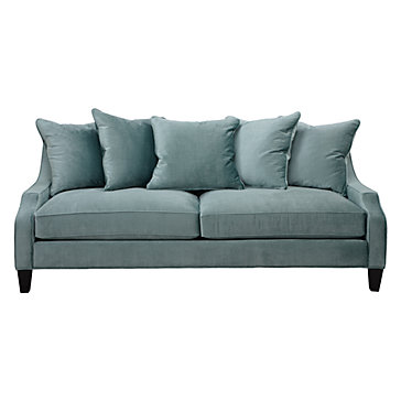
WHY AQUA IS SUCH AN AWESOME COLOR FOR A SOFA

Yes, I know. The "safest" upholstery colors for a sofa are neutrals like gray, beige or white. Sometimes  it's not the best choice. For example, if everything else in the room is fairly neutral (sisal rug, gray/white walls, etc.), choosing a colorful sofa may be just "it" if you want to bring some color into the room.
So which color is best? it depends on your preferred color palette (greens/blues or reds/golds/oranges), but some colors are better simply because they blend well with many different colors. One such example is aquamarine. It works well with so many other colors:
orange, yellow, apple green, blues, white, cream, beige, gray etc.


I've noticed this because two of my recent clients have purchased aquamarine sofa's and they look fantastic. For a bolder look, you can pick out a deeper hue, like teal, and for a softer look, pick out a lighter, grayer hue.


Portfolio eclectic living room
Bold teal sofa complements greens and blues (Katie Rosenfeld)

Aqua Sofa Design Ideas, Pictures, Remodel, and Decor - page 7
softer hues of aqua complement neutrals (Tobi Fairly)

Aqua blue sofa completes this room...

Aquamarine color combinations

Aquamarine work well with: orange, apple green, yellow, pink, cream, gray, beige, white and other blues. Below you can see the same sofa with different pillows: greens/blues/white vs. orange/white
                               Queen and Prince Philip at Ascot... blue aqua combination hat that accompanies the outfit.

                                               
contemporary family room, Newton MA - contemporary - family room - boston - Vered Rosen Design
aqua can work with greens and blues

  Love, love, LOVE the orange and aqua combination
orange and aqua or turquoise go well together
contemporary family room, Newton MA - contemporary - family room - boston - Vered Rosen Design
aquamarine and orange/cream pillows


Millie Sofa in Aqua Blue

Living Room | aqua sofa, pops of yellow & orange


Mixing with neutrals:

                                                  Cape Cod Fun
Even pick can be accented with aquamarine

                                      The fresh pink and aqua combination in this living room is really quite lovely (from House Beautiful)

So? what's your take on this? please share below.

vered@veredrosendesign.com  , Newton, MA
617-584-9965
blog
houzz

additional reading
A perfect spot for familly photos

home