Thursday, January 31, 2013

A PERFECT SPOT FOR FAMILY PHOTOS


home

The staircase - a perfect spot for family photos (before & after)

I recently helped a client redo her staircase and foyer area. 
First we painted the walls a greenish gray (sculptors clay UL170-9 Behr), replaced the staircase runner, got a new pair of curtains for the window at the top of the stairs, and finally, we hang a gallery of family photographs.
A gallery of family photographs is not only interesting visually, but also gives you a chance to reminisce and celebrate life every time you use the stairs.
Hanging those photographs took a while because we needed to plan first. We layed the framed photos on the floor to see how they would look and then started hanging them one by one, starting at the bottom of the stairs, going up. We used painters tape to help us with mark the border of the gallery.
We decided to use mostly black and white photos but different frames and sizes for a more casual look, like this one below


Here's how we hang the pictures: We first marked where the central set of pictures will go, hang them and then placed the other ones over and under them. The illustration below shows this method:


Here is the staircase before...


BEFORE

And after...

AFTER
                   

AFTER

Are there any other spots in your home that you used to showcase your family photos? please share.

If you'd like help with color, decorating and interior design, please don't hesitate to contact me for your free initial consultation.
617-584-9965
vered@veredrosendesign.com
houzz


home


Tuesday, January 29, 2013

One little trick that will make your small room seem bigger

home

one little trick that will make your small room seem bigger

The Internet is full of great ideas about how to trick the eye and make a small room seem bigger, so instead of repeating what others have already shared, I will focus on one idea that's not very obvious: 
Paint your walls the same (or similar) color as your flooring . This can work if your flooring is carpeted, tiled or it's a fairly light wood flooring (stained or painted). Even a large area rug that fills up most of the flooring space, will do.
The reason this "trick" works is this: our eyes normally perceive a room as a 3d "box". Therfore, if the walls and the flooring share a similar color, it will be more difficult for us to define where does the floor end, and where do the walls start. The boundaries between the vertical (walls) and horizontal (floor) planes are dissolved, and we then assume that the floor is larger then it actually is, and that "box" seems larger.
Below are some pictures that demonstrate this.


Media


Teenage Girl Bedroom Design, Pictures, Remodel, Decor and Ideas - page 3
source

love this home office! modern home office by Incorporated from houzz.com
source
lcool soft interiors
source

A pretty white bathroom

Tracery Interiors

blue


If you'd like help with color, redesigning or decorating your own home, contact me @ 
vered@veredrosendesign.com
617-584-9965
houzz


Tuesday, January 22, 2013

Color of the year 2013 - Emerald green

Pantone's Color of the year 2013  - Emerald green

Every year, Pantone, the global authority on color for the design industries (fashion, home, industrial and graphic design), announces it's choice for "Color of the year", and this year it's Emerald green.
Selecting the "Color of the Year" is a very thoughtful process. To arrive at the selection, Pantone quite literally scours the world to look for color influences. These influences come anywhere from the entertainment industry, traveling art collections, hot new artists, popular travel destinations and other influences such as technological advances.
Last year's "color of the year" 2012 was Tangerine. 


Did you notice that? I'm sure you did and I did too, but mostly in the fashion industry. Less so in home decor, and it's clear why:
It's easy and fairly cheap to update one's wardrobe with a few items to match the current fashion trends, but it can be quite costly to do so for your home, unless you invest in fairly small and inexpensive items such as pillows, towels and bed linens.
With that thought in mind, I happen to be in crate and barrel this week and immediately noticed they had a new bed linen set, bathroom accessories and towels in emerald green and other blue-green hues. Here's a picture I took of the lovely display at crate and barrel:


Even though emerald green by itself is certainly not my favorite color, I found the combination of emerald green with other blue-green hues extremely pleasing to the eye.
Below is a set of their towels in different shades of green and turquize.


Emerald is a glass like gemstone. 


I'm not sure if these beautiful set of glass vases that I found at crate and barrel are inspired by the emerald, but they clearly relate to this glass like gemstone.


Here's another picture I found on pinterest with the same hues. Emerald green is a very pretty color for glass containers.

                 Emerald green and aqua--I love it!

Even Pantone's inspiration pictures for emerald green include other green hues. This picture is taken from their website:

PANTONE COLOR OF THE YEAR 2013 - Emerald 17-5641

What about the more expensive home decor items? would you buy them in a trendy color?
If a client asked me if they should buy a sofa, chair or install a carpet in emerald green, this will be my advice:
If you always loved emerald green LONG before the folks at Pantone decided this will be the next "color of the year", then go ahead and buy a sofa or a chair in that color, or better yet, paint a room with this color. I would NOT install a carpet or any other fixed element in any trendy color, simply because you might want to sell your house and most likely your potential buyers aren't necessarily in love with emerald green. 
Sometimes its easy to fall in love with a trendy color simply because you see it everywhere in the stores, and it's being displayed so beautifully, along with other coordinating colors, under the best possible lighting conditions. But we all know how it feels like when you buy something that has no color relationship with what you already have at home. It just doesn't work.
Bottom line - if you absolutely love greens and blues and you've been living with these colors way before they became trendy, go ahead, take advantage of the fact that there's so much to choose from, and shop til you drop! 
Otherwise, if you hate emerald, forget about it, and if you "kind of", like it a little", you can buy yourself a top or a handbag and feel "current".


If you'd like help with color, redesigning or decorating your own home, contact me @ 
vered@veredrosendesign.com
617-584-9965
houzz

home


Monday, January 21, 2013

What most people don't consider when hanging a decorative mirror


home

What does your mirror reflect? 


Dreamy Whites - eclectic - family room - other metro - Dreamy Whites
source
                                                                    
What does your strategically placed mirror reflect?
Does it reflect pretty views from a nearby window, or your beautiful interiors?
But perhaps your medium to large mirror reflects a not-so-pretty corner you've been meaning to take care of for a while...or even just a plain wall with no pictures or decorations on it. 
Mirrors do not discriminate. They double everything around them, pretty or not.
                               
Riverhouse - eclectic - living room - new york - Thom Filicia Inc.
source
                         
Depending on where you stand relative to a mirror, it will reflect the space that's in front of it.
So if you're thinking about hanging a medium/large sized mirror in your home (entrance, over a fireplace, dinning room) consider what will it reflect when you walk by it (apart from you). If you like what it reflects, that's great. If you don't, reconsider the idea of a large mirror.
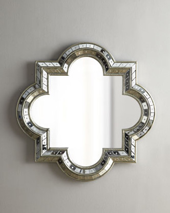
Instead, you can hang a picture or a decorative mirror with a stylish frame and a fairly small reflective area.These kinds of mirrors do not "visually expand" a room in the same way a the large mirror does, but they add a lot of spark and style to any room.
Decorative mirrors can be unique in different ways:

Mirrors with an interesting and  unique frame
The starburst mirror is a popular classic decorative mirror. There are many variations on the theme.         

Heather Garrett Design - contemporary - dining room - raleigh - Heather Garrett Design
source
                                   

1  Mirror Image Home 26" Sunburst Mirror
                                 

A flowery frame will suite a more traditional decor

Entwined Fleur De Lis Mirror | Ballard Designs
source
                               

An all mirror frame with a dynamic design that has lots of movement.

great soft colors, wall paper and mirror
source
                               

Here's another eye catching stunning mirror. The frame has an organic/artistic feel to it, which makes it so interesting to look at, so in this case it really doesn't matter what the mirror reflects.

Foyer - modern - entry - boston - Rachel Reider Interiors
Rachel Reider Interiors
                                 
Mirrors with an interesting shape

Media

                                 
powder room, interesting shaped mirror
source
                               
Set of mirrors 
Below are examples of a set of various sized mirrors displayed together. The combination of the frame and the mirror together is what makes it look so interesting and dynamic.

DIY PVC mirrors
source
                                     

Here the arrangement of the different sized mirrors over the console table creates visual interest even without an interesting frame.

Pinned Image
source
                             
Distorting mirrors
An interesting example of a unusual "cubistic" mirror.

Pinned Image
source
                     

Placing mirrors on opposite walls creates an illusion of spacial infinity.

Entry Barrel Vault - mediterranean - entry - orange county - Mark R. Eggen Construction, Inc.
source
                                 

Sometimes a mirror can "break" a bright or bold wall.


Pinned Image
source


Mary McDonald. Love the Mirror
source
                               

Here's an example of a mirror reflection that is a picture-like composition.

"Antique White" Mirror  - traditional - mirrors - Horchow
source


If you would like help with picking paint colors, or planning a home decorating project, please don't hesitate to contact me for your free initial consultation.


617-584-9965
vered@veredrosendesign.com

houzz


Friday, January 18, 2013

NOT your cold and sterile white bathroom

home


NOT your cold and sterile white bathroom


wall color and beadboard, wood flooring , wicker basket

Bathroom remodels are expensive, and just like with kitchen remodels, you have to "deal" with too many choices to choose from. So unless you actually know what you're looking for, remodeling your bathroom can get extremely confusing and overwhelming.
So what's my advice? unless there's a certain "look" you are after, or you are working with a good designer that helps you define your taste and lead you to choices you will be happy with, I suggest going for simplicity - a primarily white bathroom. But how do you design a white bathroom that is cozy, fresh and pretty? how do you NOT end up with a sterile, cold and depressing white bathroom?
My point - you CAN stick with mostly white for the fixed elements (tile, bathtub, backsplash, flooring, sink and vanity) and still create a fresh warm and cozy bathroom that you can freshen up from time to time with new accessories, paint, lighting, window treatments etc.)
here's how

1. lighting - white looks great in bright light, whether natural or artificial. 
2. Texture - using small repetitive shapes instead of color to create interest (beadboard, tile pattern)
3. Elements from nature - add a lot of warmth to white bathrooms (plants, wood, wicker, stone).
4. Detailed carpentry - detailed wood pieces versus plain "feel" warmer then sleek plain lined ones.
5. Free standing bath tubs - almost like a piece of sculpture, free standing bath tubs have a unique character.
6. Color accents - with accessories (towels, plants, soap dishes lighting) or wall color.
7. Open shelving - to display your unique accessories.

Lighting 
Maximize the natural light in your bathroom
                                      
Glass shower with window.
                           

If your bathroom is windowless and you can afford to, go ahead and add windows or enlarge existing ones. If that's not an option, use window treatments that maximize natural light. Outside mount roman shades or woven shades can be opened up in a way that doesn't cover any of the window opening.

Stern Turner Home - traditional - bathroom - atlanta - Erica George Dines Photography
                               
Lighting fixtures - If your bathroom ceiling is high enough you can add a chandelier. If not, be creative with wall sconces

High ceiling ? Add a chandelier
                       
Texture 
Texture is an excellent design tool to create visual interest in a limited color palette (white and grays). Texture is created by small repetitive shapes . Examples -  tile mosaic or patterned application of solid tile, bead boards, wicker etc.
Beadboards are a great way to add texture to a white bathroom. it's much softer looking then plain white walls.


Beadboards can be vertical (like the above picture), or horizontal. They can be installed halfway up over your walls or all the way up to the ceiling. If your bathroom has low ceiling, the vertical boards will give it some visual height. Wide, horizontal boards can create a serene and calm atmosphere.


Pinned Image
                             

Tile - you can easily skip the accent tiles. Instead, use fields of hexagonal, circle or herringbone patterned tile.

Herringbone marble floor.

Ceramic Basics - Savoy - Ann Sacks Tile & Stone - traditional - bathroom tile - other metro - Rebekah Zaveloff


Black and white tile
Pinned Image
Use the same tile material in different sizes. this will create enough visual interest (the picture below -  the same stone was used both in hexagonal tile for flooring and a smaller tile for the shower.

hex floor

Pinned Image
                                
Carera marble is not only trendy but goes well with a white and gray palette. Like any natural stone, it has it's own "character" which gives the space an instant personality. 

Bathroom decor.
                     
Phoebe Howard


Detailed wood cabinetry will add style and warmth to any bathroom. A free standing furniture piece with legs will look stylish and non-bathroomy.

Pinned Image
                               
The vanity in the picture above shows the perfect marriage between pretty and practical. The front decorative piece hides the flat baseboard behind, which closes all gaps (no need to clean underneath).

Elements from nature 
Natural materials like wood (especially reclaimed), wicker baskets and hand made stone or ceramic bowls add a lot of warmth and character . Plants are a another natural element that adds warmth (and color) to any room, and the bathroom is no exception.

               
Unique wood vanity
                               
                       
Gorgeous light and bright with vintage touches #bathroom #white
                   

A driftwood hanger offers rustic coastal appeal
                             
                 
Warm touches


stone and wood basin


Free standing bathtubs have lots of character

                                             
                                A pretty white bathroom

                                        Breadboard, free standing bath

Texture can also be introduced with interesting shutters such as in the bathroom shown below.

                                    Breath of fresh air

Color 
Add color with colorful accents or wall paint.

                                      beautiful bathroom storage
                             
Wall paint can add lots of color
                     
                               Simple and perfect

                          
Open shelving - use them to display towels and decorative accents - vintage pieces, planters, soap dispensers etc.
                                 

                                        Open Spaces, colorful touches, breadboard

                           
Bathroom - contemporary - bathroom - los angeles - Pacific Family Homes


Unique hardware

                                          towel ring

Uniquely shaped mirrors


powder room, interesting shaped mirror
                                             

If you are planning a bathroom remodel and need help navigating through all the choices you have, contact me.
vered@veredrosendesign.com
617-584-9965

houzz

additional reading
    kitchen lights that blend in with the view
    How to light up your kitchen
    white kitchens
    Choosing color - ugly and pretty cost the same!
    choosing the right lighting can do wonders
    How to fix the "gray on gray" look
    gray is the new beige

home