Saturday, January 17, 2015

How to make your bathroom look less like a bathroom


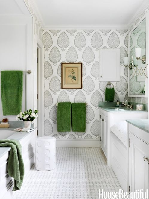
What I like about this bathroom below is that it feels more like a room than a bathroom. 

Bathroom

Why? because it incorporates pieces and applications that are more likely to be seen in a room that is not a bathroom, such as
1. side table  - more likely to be in living rooms, but certainly comes in handy when you need to place your clean clothes or even a glass of wine or cup of tea while you bath.
2. wall paper - full bathrooms are seldom wall papered because of obvious reasons (moisture), but when installed professionally and on walls that are not in direct contact with water, wall paper is a great way bring in color, pattern or texture. 
3. Art - for obvious reasons (moisture exposure), art is seldom seen in a bathroom, but when it does, it's a pleasant surprise. I would not use anything that is valuable, but cheap colorful art is definitely an option.
4. Built in bench  with a cushion - such a cool idea for a bathroom to have a cushioned seat. 

If you'd like to warm up your bathroom and personalize it - bring in elements that are more likely to be seen in other rooms: furniture, wall paper, fabric window treatments, art etc. Just make sure that these pieces can are moisture resistant or are at least not extremely valuable to you in case they absorb the moisture and deteriorate over time.

If you need help with your bathroom renovation or how to "face lift" your current bathroom, feel free to contact me at vered@veredrosendesign.com 617-584-9965

yours

Vered


houzz


Thursday, January 8, 2015

Inspirational bathrooms I love

Starting with this post, I will begin sharing bathroom photos I've collected over time and found to be inspirational in one or more ways. Each one of these bathrooms has at least one idea you might be able to "steal" for your own project. 

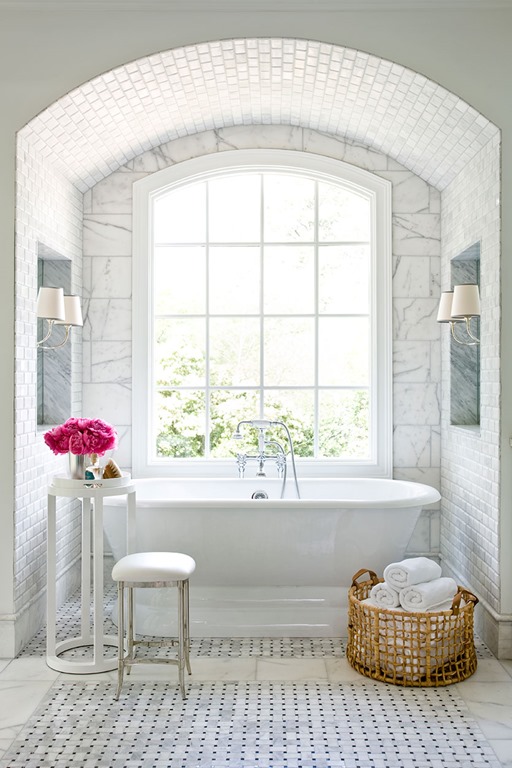
This is the first photo of a beautiful, luxurious white and gray marbled bathroom.


Photo: Erica George Dines
Why is this luxurious master bathroom so appealing?
symmetry - symmetry is always pleasing to the eye. It gives us a sense of order. In this bathroom symmetry is everywhere: 
1. The large beautiful window is centered in the arched niech.
2. The free standing tub is centered under the window
3. Symmetrically centered two wall niches with two identical wall sconces.
Emphasized architecture - everything in this bathroom works to emphasis the architecture of the room - for example, the tiled arch and surrounding wall tiles around the window emphasize the shape of the arch and window.
Tiled mosaic "area rug" - I love this application. In this bathroom, the centered tiled floor mosaic looks almost like an area rug, surrounded by large marble tiles. This application also emphasizes the room's symmetry and gives the floor a unique definition.
Color scheme - white, gray and black is a classic combination. 
Texture - The key to creating white bathrooms look interesting and inviting is texture. A variety of tile sizes and patterns in white and gray, as well as the right wall color make this bathroom look interesting, unified but not stark.
Free standing tub - this bathroom says "luxury" not only because of the high ceiling, expansive windows, arched niech, and the uncompromising symmetry, but also because of that beautiful free standing bathtub, centered right under the huge window.

Below is a photo of the same bathroom from a different angle. Here's an example of a really cool application of mirrors
Mirrored niech - In this particular bathroom, placing a mirror in the niech, not only defines the niech, but also reflects in light and views from the adjacent windows in day light. At night, it visually "doubles" the wall sconces.


Bathroom Renovation Trends