Monday, February 27, 2012

Decorating with neutrals

Decorating with color can be intimidating to many. People are often afraid of picking the “wrong” color, or simply don’t want to commit to a specific color which they might get tired of down the road. There are reasons for that.


Color is tricky. We see color in a comparative way, meaning that every color does look different in different contexts (i.e other adjacent colors). Lighting affects how we see color as well. For example, blues look better in southern facing rooms then northern ones, where they seem too cold. Also, colors will look different under daylight conditions versus artificial lighting. Color evokes psychological effects whether we are aware of them or not. In short, color has a clear presence, which can be a very bossy one too.

Neutrals, on the other hand (white, gray, black and beige) seem like a “safer” choice to many people. Neutrals can easily be mixed with each other, as well as with vibrant colors. The reason for that is that neutral colors are actually a combination of all colors at different ratios.  Beiges can be greenish, yellowish or pinkish. Grays can be bluish, purplish or greenish.
So why do so many neutral rooms seem boring and static? The reason is that they often lack one or more of the following:

Contrast – when there’s hardly any variation between the darkest and lightest neutrals in a room, it lacks contrast and excitement.  If you are not sure, try taking a picture of your room, convert it to black and white and you will see what I’m talking about.


Pattern – if everything in the room is solid and neutral, chances are that it will be visually static and boring. Bold patterns add visual energy into a room. It could be a grid of black framed pictures, a boldly patterned fabric (on a chair, curtain or pillow)or a patterned rug (animal prints or geometrical prints have a great impact on the level of excitement

Texture – decorating with a variation of contrasting textures  – smooth/ rough, shiny/flat, tight/ relaxed . some examples of contrasts: glass/sisal, distressed wood/metal


Variety of materials – a mix of different materials is intriguing and sophisticated – wood, metal, wrought iron, glass, wicker, sisal, pottery, leather, fabric, shag rugs, plastic, plaster.

Interesting lines – lines create movement and avoid a static feel. if you are decorating with lots of white, add pieces that have interesting lines to them – wrought iron lamps, capis lamp


Add something black – every room needs something black and neutral rooms benefit from more than one piece. Black creates depth and emphasis.


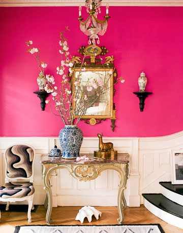
Accent color “pop” – in an all neutral room, even a tiny bit of vibrant color can “lift” the look. It can be a pillow, chair, vase, picture, lamp shade, anything really. Try placing that “pop” of colorful object where the focal point is. This will draw attention to where you want it.


The advantage of keeping a neutral color scheme and adding small accent colored pieces, is that it’s fairly easy to change the look with a simple change of the accent pieces.


Plants – plants are always a great addition to any room. A cheap way to bring in life, color and stay in the neutral theme

If you'd like help with color, redesigning or decorating your own home, contact me @ 
vered@veredrosendesign.com
617-584-9965


Friday, February 10, 2012

Not a cookie cutter white kitchen


simple ways to spice up any white kitchen

In follow up to my post on white kitchens, I’d like to share some ideas on how to give a white kitchen your personal touch.


Color 

      
Painting the walls around the cabinets with medium to dark shades will create depth and definition: Your cabinets would instantly "pop out" visually.  A deep shade will be bold and dramatic, while a softer lighter shade will keep the look light, airy and calm. If your cabinets take most of the wall space, you can be more adventurous with vibrant colors or darker shades of neutrals, depending on the colors of the counter top, back splash and flooring and the look you're after. 
                                                          
The green walls emphasize the entrance to the dining room and echo the dining chairs
                                                            
      Painting the Inner sides of glass cabinets. An accent color will draw instant attention and visual interest. This works well if you wish to emphasize those cabinets. If they are sort of "randomly placed", painting them with an accent color would emphasize that too....


The painted upper cabinets emphasizes their different sizes of the cabinets. I assume there's another tall cabinet on the right side of the shorter one. otherwise, it wouldn't work well.
                                                                                  
      
     Back splash tiles. Depending on the look and feel you're looking for, neutral gray tiles are sophisticated and classy, while bright clean colors, like turquize look fresh and playful.


                                                                         source


      Colorful furniture. A pair of bright colored stools may be all you need to spark up your kitchen.


      Open shelving display. Works well if most of your kitchenware will be store behind doors.  Open shelving can look great if you own an interesting collection of kitchenware. Keep it light and cohesive in the spirit of "less is more" - a few pieces that relate well to each other (common colors, shape or style). 


The light gray paint and mosaic tiles create a perfect backdrop for this charming open shelving display. 


Pattern
White works well with grays and blacks, so patterns in these shades can be introduced          tile, upholstery


        Unexpected lighting fixtures  can make a visual statement.While you need to consider the more practical issues of lighting such as wattage, ceiling heights and placing the fixtures in the right place, have fun choosing funky, artistic or unusual lighting fixtures.  For example, placing an outdoor lighting can be a surprising twist. Remember to keep the scale of the fixture appropriate.
      If you don’t have an island, an interesting pendant over the sink can work as well. 

Pottery barn's cluster of jar lighting fixture can be hanged over an island or a dining table

Tobi Farley's fabulous kitchen incorporates bluish gray cabinets and cool &shiny pendants over the island.

Katie Ridder's kitchen: cool fabric-like glass pendants, shiny aluminum bar stools and apple green accents 
                                                                       
          Unique appliances. With an almost standard look of stainless steel appliances, a unique stove or a hood will stand out and can be a focal point of interest.

The La Cornue range was hand made in France to designer Susan Dossetter's specifications. "It's so beautiful, it's almost like jewelry for the kitchen."
Eclectic furniture mix.  A vintage table or an interesting mix of chairs could transform the look from ordinary to unique. Mixing styles is always a unique look.

An eat-in kitchen featuring an eclectic mix of furniture pieces: Louis XV style chairs around a19th century French farmhouse table and   
Black accents. Black (or dark brown) adds depth and definition to any pale white room. Dark brown or gray objects would have a similar effect. It could be an interesting light fixture, a pair of wrought iron stools, black& white patterned upholstered chairs or window treatments. Even an interesting wall decor like a clock or a picture can do the trick . 


The black lanterns and stools make this all white kitchen look sharp and grounded


Mixing up accents (lighting, furniture, paint, tile or window treatments) can be done succesfully if    you coordinate and balance them well.


This fabulous white eat-in kitchen incorporates sage green and black accents. The warm wood flooring balances the cool palette

If you'd like help with color, redesigning or decorating your own home, contact me @ 
vered@veredrosendesign.com
617-584-9965


 related posts
 kitchen lights that blend in with the view
 How to light up your kitchen
 white kitchens
 Choosing color - ugly and pretty cost the same!
 choosing the right lighting can do wonders
                                                                 

Monday, February 6, 2012

Creating Atmosphere

    
home

tranquil and charming bathroom
Creating Atmosphere

You've probably felt it before, at a restaurant or a friend’s home. You walked in and instantly felt something special – a sense of peace, warmth or perhaps even excitement. You couldn't quite figure out what it was that left such a long lasting impression on you, but knew it was there, and it felt "just right".


A beautiful and inspiring room is not just about making it look pretty with well coordinated colors, fabrics, furniture and accessories.  It’s about creating a certain “mood” or “atmosphere” and it’s easier said than done, I know. J

 “Atmosphere”: “a mood, vibe, or emotion that is conveyed by the setting”.

It takes inspiration, focus and self expression to create that special positive "vibe", but it can be achieved. Here are a few tips:

·        You can identify and follow a certain decorating style that you absolutely LOVE (coastal, French country, ethnic, japanese). Every style has a typical feel to it, and a clear sense of “personality”, which is why people choose to decorate in a certain style. For example coastal is relaxing, informal and airy (colors-whites, blues and greens). French country is romantic, nostalgic, feminine and relaxing (colors-soft whites, yellows, blues and greens, curvy lines). Ethnic is warm and rich (earthy and jewel-like colors).

cozy neutrals, coastal
                                                                          
coastal


·         Alternatively, identify a feeling or sensation you want to feel in that room (fresh & airy, cozy, elegant, playful, peaceful, romantic?) and translate this feeling into tangible objects and colors. Look carefully at anything you consider adding and ask yourself one question: does it express the atmosphere you are looking to create? if not, keep it out. If you like it, put it some place else.


Happy and colorful
                                                                         
Dramatic
                                                                            
                                                                    
The next step will be translating this emotion or sensation to design tools.  It takes practice and experience to successfully master translating a feeling to décor, but here are a few tips to start with:

1.     Color – this is your primary tool. Colors have typical psychological effects. For example, Blue is relaxing and cool. Red is energizing and warm. Also, the shade of a color (how dark or light it is) and the saturation of it (how clean or dirty it is ) also define their emotional effect. For example, soft, light (pastel) shades tend to be peaceful and airy, while darker shades are warmer. Bright clean colors are energizing and playful, while muted (earthy) colors are calmer and cozier.

Playful
2.     Lighting- I cannot stress enough how important lighting is. It can make or break a design. If you’re on a budget (whose not?), lighting would be at the top of my list. 
                                                                       
3.     Furniture and accessories – choose carefully: whatever you are thinking of placing in that room, look at it and ask yourself if it gives you that feeling you are after. If it’s not, but you still love it, place it in another

4.     Natural light and greenery –natural light can “lift up” a room and fill it with positive energy, so try to maximize natural light exposure. The same goes to adding plants. This works with any style or mood.  A cluster of different plants or one large one is better than just one little pot.


Light and airy
                                                      
5.   Window treatments - window treatments vary in style and help set up the right mood. For example, extra long, soft colored sheer curtains work beautifully with a romantic mood. Roman shades in a neutral solid color, or bamboo woven shades would both work well with a minimalistic tranquil  "zen" theme.
                                                        
Romantic and feminine

Whenever you choose fabrics, furniture, lighting or paint for a specific room, ask yourself if it expresses that specific feel or mood you want to convey. If it clearly doesn't, but you still really like it, try using it for another room instead.
One last thought I wanted to share with you: 

So why is it not trivial to design a room that expresses a mood?
The following experience is illustrative. When I was younger, I used to follow the prestigious “Arthur Rubinstein” piano competition that took place in Israel and was broadcasted live on the radio. Initially, it seemed like it will be impossible to select a winner because absolutely ALL the competitors were outstanding pianists: they memorized and mastered an extremely challenging repertoire, had an amazing technique and played musically. However, there were only a few of them who made you “feel” something special when they played. They literally touched you: an unforgettable and rare experience. These were the winners.

So here's my point -  the reason why creating atmosphere in a space is not trivial, is that just like the prerequisites to enter that prestigious piano competition, it takes more than just following the basic principles of design: proper balance, proportion, harmony, rhythm and emphasis. It takes vision, inspiration and self expression.


If you'd like help with color, redesigning or decorating your own home, contact me @ 
vered@veredrosendesign.com
617-584-9965
houzz

 How to light up your kitchen