Friday, December 27, 2013

How a design mistake turned into an invaluable learning experience

A few weeks ago I took an online course/webinar ("Design webinar") with Maria Killam and Penelope Trunk, which has been excellent. Maria and Panelope are two amazing women, each running their own successful blogs and businesses, so they teamed up together to share their insights with us.

During one of the sessions, Maria said something really interesting about learning from failure: "when you succeed, you have no idea what you did right, so its not much of a learning experience, is it? but when you fail...oh well, that's when you go "ahahh!!"
So that made me think: What if you didn't get that "aha moment" right away? what if you didn't really understand why you failed so miserably and how you can avoid that from happening again. 

I'll be honest with you. When I make a mistake or feel I've failed,  I don't immediately go all "positive" and take it as a "learning experience". First, I feel really terrible (especially if it affected other people) and then I obsess about it for days on end.
But here's the good news. I realized that obsessing is actually a good thing, because it makes you think really hard and intensely about what just happened and then maybe, just maybe, figure out what went wrong, why it did, and how you can avoid it from happening again.

Sometimes, I "get it" right away and sometimes the "aha" moment comes much later. The point is - it's never too late, and if it doesn't come right away, there's a reason for it. You simply might not have the experience and knowledge to understand why something you did went wrong.

Like with that blue sofa and love seat choice I made many many years ago, after dragging my poor husband to each and every furniture shop in Tel Aviv, not knowing what I was looking for (sounds familiar?), which was the crux of the matter. 
So when the delivery people placed the blue sofa and love seat in my empty white living room, my heart just sank. Did I not know it was the wrong color then? YES, of course I did! did I understand why I chose the wrong color and why it was wrong? no, I didn't.  But how could I know? I didn't know anything about design back then, or color, lighting etc. I just knew it was important to me, and that something went wrong. Here's what the sofa and love seat looked like.


So what did I do? I warmed the room up using other design tools
1. I bought a lovely terracotta wool rug (this time showing my husband just TWO choices).
2. I Added some colorful pillows that picked up the rug colors (gold and terracotta and red).
3. Hang sheer off white curtains.
4. Added lighting -  a floor lamp with a couple of table lamps.
Did it help? it did, but it wasn't enough.

Had I walked into this situation today, I would have "fixed" the problem in a slightly different way, simply because I have way more knowledge and experience then I had back then.
what would I do?
1. Paint the walls - I would paint the walls a warm off white or light neutral such as muslin, white linen (benjamin Moore) or aged parchment (sherwin williams). Walls take so much of the space, painting them would have the a greater impact then adding pillows for example.
2. Pick out a different rug. As much as I love foliage colors and that specific rug I bought, a sisal or warm neutral would have worked better with the blue sofas. 
3. More lighting. a single light fixture is never enough for any room. I would have added more table lamps and/or wall sconces and make sure they are positioned so the whole room is lit with a soft warm light.

The "I get it!" moment should be clear, not fuzzy, and if you don't get it right away, it's ok. It might come later, so keep thinking and searching for answers. When you are more knowledgeable and experienced it will suddenly come to you. just like that. boom! 

Happy new year everyone!

Vered

Friday, December 13, 2013

My recipe for a successful party

It's the holiday season and some of us are hosting parties. So what makes a successful party so awsome? the food? the drinks? your fabulous new outfit? not so much. It's the people, you and your guests, and how welcome and comfortable they feel in your home.


Imagine this:
Your guests feel at home the moment they arrive.
Everyone to has a great time and stays until the end.
Afterward, they can't stop talking about it.
Wouldn't that be great?

So what can you do to make your space feel warm and welcoming?  there's a LOT of things you can do, and two of the most important are these: 
1. Conversational seating arrangements.
2. The right kind of lighting.

Conversational seating arrangements 
What's most popular living room seating configurations? the L shape sofa and a love seat (at right angles to each other). This may work well for watching TV, but not for conversation. For people to converse comfortably, they need to be seating close and face each other. In the L shaped arrangement, it's only the ones seating at the end of the sofa/love seat that can talk to each other relatively comfortably. Why relatively? because they need to twist and turn to face each other. All the others will find it uncomfortable to converse across the room.
so what's the best conversational seating arrangements?


A sofa + two chairs (and a coffee table in between) 
Why does that work?
  1. Everyone is close enough and facing each other so it's easy to converse. The "chair people" are directly facing the "sofa people" and close enough to each other.
  2. Flexibility - chairs can be moved so it allows your guests to move them around as needed.
  3. Casual, comfortable feel - if the chairs are at a diagonal, the room feels more casual then if they are placed at straight angles. It's easy to switch between a formal to informal look, simply by moving the chairs.
  4. Visually balanced look - from a design point of view, it's a balanced, symmetrical look that can be easily switched over to a more formal look by placing the chairs at right angles to the sofa or next to each other (facing the sofa).
  5. It's best to have a combination of sofa's and chairs so everyone finds their own comfortable spot, whether it's seating close to their spouse on the couch or keeping their personal space with an individual chair.


Where  would that seating arrangement work best? everywhere, but especially in small to medium living rooms. 

Two sofas facing each other with a coffee table in between.
Why it works? People are close enough and facing each other, like around a rectangular dining table.
Where would it work?
In a large open space living area with a focal point facing the coffee table (like a fireplace). This is why it's not a very popular plan around where I live, where most houses are traditionally built, with smaller spaces confined by walls. In these houses, "floating" two sofas in the center of a room would most likely stop the flow. Contemporary, high ceiling, open spaced rooms often feel too expansive and open, so floating furniture would "cozy up" the room without breaking the traffic flow.


U shaped seating (for large living rooms)
This one has many variations: sofa plus love seat and two chairs facing the love seat, a sofa and four chairs (two on either side), sectional plus two chairs etc. Again, this works because everyone is in close proximity and facing each other, much like around a square dining table.
lighting 
If you ever noticed the lighting in upscale restaurants? it's warm, somewhat dim, no shadows or dark spots, the kind of lighting that makes you feel better about your looks. That's what you'd like your living room to feel like. Contrary to what you might think, you don't need to spend thousands of dollars to achieve the kind of lighting that will make your guests want to move into your living room forever. Basically, good conversational lighting means: creating a warm, slightly dim lighting all around. No shadows and dark spots.
Here are some guidelines to help you achieve that:

  1. Flattering light - which kind of lighting is more flattering?candle light or strong bright light? the answer is obvious, and everyone feels more confident when they look good, especially the ladies. Your guests would naturally gravitate to where the lighting is warm and dim, and away from the bright, cool light.
  2. Table and floor lamps cast a warmer light then recessed lights do. "Down lights" like recessed lights can create unflattering shadows on people's faces.Dim your recessed and ceiling lights and turn all the floor lamps and table lamps on. 
  3. Pay attention to the color temperature of your light bulbs - if you're using fluorescent (CFL) bulbs, choose the "soft white" and not the "daylight" (the daylight have a cooler light spectrum).
  4. Multiple light sources - better to place multiple lamps around the room on medium wattage then just one or two strong ones. They allow to control the mood. No one feels comfortable talking under a strong light source.
So to cap it all up, just remember this:
People feel comfortable talking when:
1. They are close enough and facing each other, but still maintain their own personal space.
2. When they have choices (between cozying up on a sofa or keeping their personal space on a chair).
3. Flexibility - being able to move around chairs, ottomans will allow people to move around and not get "stuck" in one single conversation.
4. Don't skip the coffee table - it's not only there for glasses and plates, but it anchors the whole seating arrangement. You should have about 18" clear space between the chair/sofa and the coffee table for comfortable reach and walk through.
5. Lighting

Monday, December 9, 2013

Having doubts about your decor? try this simple trick and you'll know

I'm a DIY kind of person, always experimenting. It's no wonder that my previous career was a molecular biologist. Experimenting was what I did every single day in the lab. 
Anyway, I've recently stumbled upon this article about how to pull together an eclectic room. It's not so simple to get it right, because its easy to cross that fine line between whimsical charm to hodge podge.
That is why you need to experiment until you feel it's balanced. 
What if you're not sure, or simply confused? this is when you take out your camera and snap some shots. Take a break from the whole project and then look at the shots. You'll be surprised how much clearer it will be for you to see what's off balance or just "not working" and what's good. 


source


I've been using this trick forever, and it just works! anything that wasn't clear in "live view" becomes much more obvious when you look at the photos. I use this trick at different stages of a project and especially when I photograph a completed project for my website. I take a LOT of shots to get just a few right. 

Why can we see clearly in a photo what we couldn't quite get looking at it "live"? I'm not sure.
Perhaps it's the isolated single angle that makes it obvious to the eye, or the fact that we are not moving around and getting distracted. Well, whatever the reason is, it works! and that is what's important.
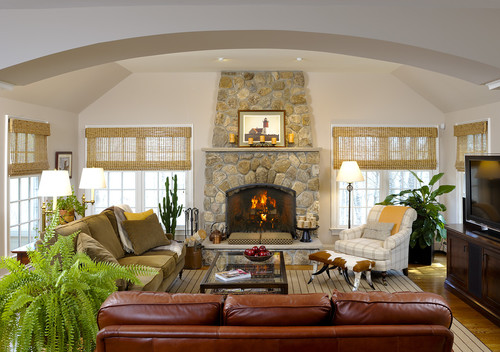
Here's a beautiful eclectic room. Contrary to what you might think, even for the pros it can take a lot of experimentation, and "failed" attempts to get to the point where an interior can look almost effortless, like this one below.


Olive Interiors - Home
source
If you wish your home to be a place you'll always love coming back to, but not sure how to create one, contact me at 617-584-9965 vered@veredrosendesign.com and I will help you make it your own.


houzz