Wednesday, March 27, 2013

HOW TO DECORATE WITH BRIGHT COLORS - DO'S AND DON'TS

A healthy does of white  - bright colors look best when surrounded by lots of white (or certain grays). Call it ying-yang or energetic vs. static, but this rule is probably the most important to remember when working with bright color schemes. Take a look at professionally designed interiors in magazines, and notice how bright colors are usually surrounded by white, gray or some neutral element like wood or sisal.
Here are some examples;


source
Why are neutral sisal and jute rugs so popular today? yes, they fit in with the eco green trend, but they also serve as a perfect backdrop to color.


This color scheme plays with lime green and watermelon calmed by lots of white.  The lighthearted floral in the near chairs is charming and the bold color is carried to the far end of the room.
sisal rugs are natural and neutral (perfect backdrop to color pop)


Lots of natural light - yes, I know. EVERY interior looks best in ample lighting, preferably natural, but this is especially true for rooms painted in white or light gray, as a back drop for pops of color in furniture and accessories, especially ones with blue-green color palette.
Bright colors need a healthy dose of white around them and bright natural light


A little goes a long way - unlike earth tones or neutrals, bright colors are really intense and very dominant, so a little goes a long way: the impact of a few bright colored pillows, a colorful lamp base and a bright colored side chair can be just enough to jazz up a room. All the rest can be kept neutral. An accent wall is not for every room, but it allows you to bring in a brighter color without overpowering the whole space.


Stick to a color scheme that works - Play it safe with tried and true color schemes such as blues and greens. 

Vered Rosen Design


pattern vs. solid- the above suggestion of " a little goes a long way" is even more important to remember if you are using pattern. 
The brightly patterned pillow on the right is bolder than the solid one the left.
   
Cabana Geometric Pillow - Cobalt


Avoid mixing very bright colors with muted earth tone colors - I discussed this in another post, but in short, earth colors like browns, ambers and lots of beiges will look "dirty" next to bright "clean" colors. 


vered@veredrosendesign.com
blog
houzz


Tuesday, March 26, 2013

WHY DO BRIGHT COLORS CLASH WITH MY EARTH TONED DECOR AND HOW CAN I FIX IT

Bright colors are everywhere now: home interiors and fashion are the most obvious. Now that spring is here (or ALMOST here if you live in Boston), you might have tried to incorporate some bright colors in your home home, and maybe noticed that it doesn't quite "fit" like it does in the store display. 
Why is that? if your home is decorated in browns, beiges and other muted earth tones, you'll find that these deeply muted earthy tones simply clash with bright colors. I'll explain this below.

Complex vs. pure - Earth tones contain a predominant bright color PLUS a little of the complementary color in them, which is what "mutes" or takes the edge off the brightness of the predominant hue.  For example, a muted red has some green in it, or a burnt orange has a bit of blue in it. This is why earth tones are considered "complex" colors. It simply means they contain more than one hue in them, and that is exactly why earth tones easily blend with each other like in this picture below. 


Earth tones also blend really well with each other in home interiors.


Bright colors, on the other hand are more "pure" which mean they contain mostly one hue (yellow, blue, red, orange, blue green etc.) plus some white and maybe a tiny bit of the complementary color just to take off that edge a little. 

That is why bright colors appear "cleaner" then earth tone colors, and that's exactly why if you try to bring in a bright colored pillow or rug into a room full of earth tone colors (like the one above) it will make everything else around it look "dirty".


bright colors are more pure and work best with white and grays
 (design - Lindsey Harper)
              
So what  if your current decor is predominantly earth toned but you'd love to bring in some more color? here's my advice:

1. Brighten up the room with spice or jewel tones - not all earth tones are born equal. Some are brighter than others. Nature, of course is a full of great examples. Look at the picture below: the yellow and purple leaves are much brighter then the other leaves, yet they still blend well with the more muted hues of the other leaves.
You can apply this to your decor.


bright and dull earth tones can live together happily

Spice colors (burnt range, reds, mustard yellows) are richer and brighter then the more muted earth tones (browns, amber, beiges), but still blend well with each other 


spice colors

This bedroom is another example of rich ethnic colors and textures (though not Russian inspired).  Or should it be included in the earth tone palette?  One of the best things about design is that the label doesn't really matter if you like it.
earth tones jazzed up with orange spice tones

The color palette above is an excellent example of a combination of muted earth tones and brighter spicy orange. Nature, of course is full of examples, like in the foliage leaves photo I found
Autumn Leaves Fall Foliage
foliage color range brightness - from dull to bright

Jewel tones can also blend well with earth tones.


2. Going lighter and brighter on the walls  - for an updated sharper look, try repainting your beige walls with a warm off white or cream. This will brighten up the space and create a bolder,  more contemporary look. Yet, this "trick" will only work if you have lots of natural or warm artificial light in the room.White or off whites will look sad and dingy in a dark room. 

                            
rich and bright spice colors with a warm off white backdrop
                               
Bottom line - if you fell in love with the current trend of bright colors, but own a home full of earth tones, you can still brighten up the space by adding the brighter "cousins" of earth tones such as spice or jewel tones.
feel free to leave any comments below,

vered@veredrosendesign.com
blog
houzz


blog home


Wednesday, March 20, 2013

Affordable teenage girl's bedroom - Get that look!

home

Teenage girl's bedroom - Get that look!
Today I will share my sources for a girls bedroom I designed.
 All the items are from very affordable stores like Target, ikea, home depot, marshalls etc.

Here it is:
The wall lamp and wicker trash can are also from ikea and the shag rug is from home depot.


If you need help with your own project, and would like it to be beautiful and yet, affordable, you can contact me through email or phone 617-584-9965

vered@veredrosendesign.com
blog
houzz


Easy DIY - Salvaging a mirror with a can of metalic gold spray

Salvaging a mirror with a can of spray 
Yes, this isn't a new idea, but it might come handy when your online purchase of a mirror that looked really different on the screen arrives, and you are cranky because you don't like the finish. "It looked so different on the screen!" you whine. Spray painting is easier then you might think. I even shared the nice, antiqued gold finish spray can I used for my mirror.
When the mirror I purchased online from home decorators (for only $53) arrived, I knew that I still liked the shape of it, but the actual finish was totally different then their online picture.So after a "lived" with it for a short while, and stil didn't like it, I just went out bought a can of American accent metalic gold spray paint , placed the mirror on a few sheets of newspaper  (outside on the walkway) and spray painted it about three times, until the whole mirror looked evenly colored. I chose that specific brand of spray because it wasn't a shiny gold and it was appropriate for metal surfaces. The whole process took less then half an hour!
blog home

Can you share any of your own "spray can" easy projects that worked out well?

Vered

vered@veredrosendesign.com
houzz
blog 


Tuesday, February 26, 2013

Start with the "why?" - designing with a purpose in mind

blog home

Designing with a purpose in mind


What drives us to keep changing our home interiors?
Why do we keep rearranging our furniture, buying new stuff, repaint, buy more tchotchkes?
Is it because the "old stuff" is dated, not functional or both? usually that’s not the main issue.
Is it a manifestation of our need to fill in an empty feeling with more "stuff"? not only. I don't believe so.
So, what is it? what drives that "itch" to change?
I think that we keep launching “makeover” projects because we have an innate need to live in a place that makes us feel happy, excited, balanced, inspired, calm, etc. Whatever it is, it's always about the feeling first.
It's the "ambience" of the room that matters, not merely the looks. 
Understanding this human need is key to a getting it right.
Let me explain. Color, for example has a profound effect on us. It can feel cold, warm, energetic, happy, etc. But color preferences are still individual. Most people either prefer cool colors (blues and blue-greens greens), while others prefer warmer tones (orange, red, yellow). Let’s take the bedroom, for example. Some would prefer a soft but warm tone. Others will feel better surrounded by cool blues or greens. And yet, some people would choose a deeper, more energetic color.
What about styles? different styles are associated with memories and various associations, depending on your personal history and past experiences. That’s why we all have different tastes, which can change and evolve throughout our lives, simply because we change and evolve ourselves, even if we haven’t noticed it.
So why is it so hard for most of us to create a room that we are really happy with?
If you don't know what to look for, it makes it really hard to find it, right?. Shooting in the dark is an option, but not a very efficient one.
Ok. so why is it so hard to "translate" that feeling we want to feel in a room to an actual design? because translating a feeling to tangible stuff like color, shapes, line etc. is art, and like every art, it takes experience, enthusiasm and some failures on the way to get it right.
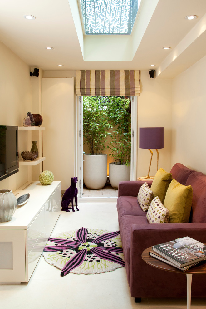
Here are some examples of what I mean by interiors that evoke a feeling:

                   
Teenage Girls Bedrooms
sweet

Bobo Vertebrae Pillow  from Jonathan Adler
playful


Blank Canvas
Airy, happy and playful

A simple color palette, interesting textures, and that "I'm not trying too hard" style of pattern-mixing.
calm, soothing


Whiporwill - traditional - family room - new york - Callaway Wyeth
warm
Colorful Combination
ENERGIZING!

               
Study: Brian Del Toro Inc. - contemporary - living room - new york - Rikki Snyder
mysterious
Do you agree with my captions, or do these images evoke a different feel? 
please share in the comments below   

Vered 
    

vered@veredrosendesign.com
houzz
blog

blog home

Thursday, January 31, 2013

A PERFECT SPOT FOR FAMILY PHOTOS


home

The staircase - a perfect spot for family photos (before & after)

I recently helped a client redo her staircase and foyer area. 
First we painted the walls a greenish gray (sculptors clay UL170-9 Behr), replaced the staircase runner, got a new pair of curtains for the window at the top of the stairs, and finally, we hang a gallery of family photographs.
A gallery of family photographs is not only interesting visually, but also gives you a chance to reminisce and celebrate life every time you use the stairs.
Hanging those photographs took a while because we needed to plan first. We layed the framed photos on the floor to see how they would look and then started hanging them one by one, starting at the bottom of the stairs, going up. We used painters tape to help us with mark the border of the gallery.
We decided to use mostly black and white photos but different frames and sizes for a more casual look, like this one below


Here's how we hang the pictures: We first marked where the central set of pictures will go, hang them and then placed the other ones over and under them. The illustration below shows this method:


Here is the staircase before...


BEFORE

And after...

AFTER
                   

AFTER

Are there any other spots in your home that you used to showcase your family photos? please share.

If you'd like help with color, decorating and interior design, please don't hesitate to contact me for your free initial consultation.
617-584-9965
vered@veredrosendesign.com
houzz


home


Tuesday, January 29, 2013

One little trick that will make your small room seem bigger

home

one little trick that will make your small room seem bigger

The Internet is full of great ideas about how to trick the eye and make a small room seem bigger, so instead of repeating what others have already shared, I will focus on one idea that's not very obvious: 
Paint your walls the same (or similar) color as your flooring . This can work if your flooring is carpeted, tiled or it's a fairly light wood flooring (stained or painted). Even a large area rug that fills up most of the flooring space, will do.
The reason this "trick" works is this: our eyes normally perceive a room as a 3d "box". Therfore, if the walls and the flooring share a similar color, it will be more difficult for us to define where does the floor end, and where do the walls start. The boundaries between the vertical (walls) and horizontal (floor) planes are dissolved, and we then assume that the floor is larger then it actually is, and that "box" seems larger.
Below are some pictures that demonstrate this.


Media


Teenage Girl Bedroom Design, Pictures, Remodel, Decor and Ideas - page 3
source

love this home office! modern home office by Incorporated from houzz.com
source
lcool soft interiors
source

A pretty white bathroom

Tracery Interiors

blue


If you'd like help with color, redesigning or decorating your own home, contact me @ 
vered@veredrosendesign.com
617-584-9965
houzz