Monday, July 30, 2012

Picking the right light bulb can change the color of tile

home


I've just completed a kitchen redo and my client is very very happy. However, as sometimes happens, the way to eternal happiness can get a little bumpy... 
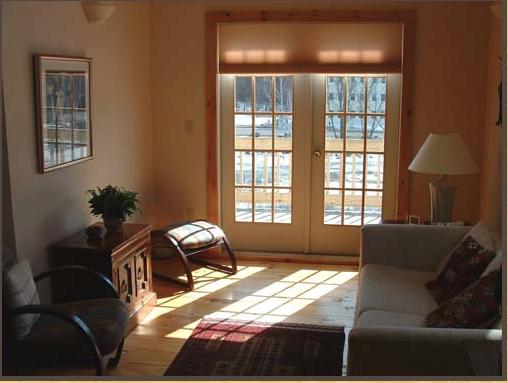
We were looking for tile with only a slight tint of blue/green (there are hardly any walls in that kitchen to add color with paint) and chose glass, because it's light and airy and it picks up the slight bluish gray tones in the jet mist granite counter top.

After looking around, there were two final choices to pick from. Both had a greenish-bluish undertone but one was slightly greener (option 2) than the other but it was readily available and better priced than option 1, which would take a couple of weeks to ship.

bluish-greenish glass tile (option 1)


slightly greener option (option 2)

She decided to go with option 2. The emergency call I got was after the tiles where on the wall, but before the lighting and grout were there. "it's green!" she said. She was right. The same tile which looked so airy and pretty before, looked greener and grayer under the dark shadows of the upper cabinets.
It looked more like this:


I reassured her that it would look much better with the under cabinet lighting, and that a cooler lighting choice such as a cool fluorescent or LED might do the trick of making that tile look slightly more bluer, and guess what, it did! We used 4100K LED under cabinet lighting and it looks fabulous!


For those of you who are interested, here's a bit of theory about lighting color temperature  
In the lighting world, color temperature (how warm or cool the light looks) is measured by Kelvins (or "K"). The lower the number, the warmer it looks. For example: candle light is 1800K, warm incandescent light is around 2700K and cool fluorescent is 3700K-4200K. Here's a chart that shows the different lighting conditions in terms of color temperature:


It's interesting to note that day light is actually much cooler than one would think, even cooler than most fluorescent light bulbs. The reason is that fluorescent light doesn't have the full spectrum of day light.

So the next time you think "nothing can fix it", don't be so sure. It might just as well be the right kind of lighting that will do the trick.

yours,
Vered


If you'd like help with color, redesigning or decorating your own home, contact me @ 
vered@veredrosendesign.com
617-584-9965
houzz

related posts
 How to light up your kitchen

home


Thursday, July 12, 2012

Therapists - what to consider when designing your office

home


When meeting a therapist for the first time, clients are looking for clues on how professional this therapist is. No wonder they're looking at their therapist's immediate environment (their office) for those clues.
Studies have shown that people judge the quality of their therapist by the way their office  looks. Clients also mostly agree on what would an office of a good therapist would or wouldn't look like. So here's a summary of what a "good therapist" office should look and feel:
  • Organized, orderly. clean - People often come to a therapist to acquire a sense of order and control over their life. n orderly and neat office not only helps a client relax and feel at ease, but also reflects on the therapist's sense of control. A cluttered office is distracting, evokes feelings of nervousness and reflects badly on the professional abilities of the therapist. 
  • Warm and inviting. calm. - soft fabrics, comfortable chairs, a warm area rug, dim lighting and a soft, warm color scheme help create a welcoming and comfortable environment. A space that feels a little bit like home, but not quite.
source

  • Lighting - people tend to speak more openly when the lights are dimmed. They feel less exposed. Use standing or table lamps instead or in addition to ceiling lights. Wall sconces are great too, though more expensive to install. Always use dimmers. In some situations more light is needed than others (sunny vs. overcast days)
  • Personalize your office - displaying diplomas and awards makes the therapist appear more qualified  to their clients. Moreover, displaying personal items can make the therapists themselves feel more comfortable, thus enhancing their clinical effectiveness. After all, this is your office, and therefore it should express who you are - your unique personality and professional strengths.
  • Clocks - placing them in a way that clients can or cannot see them is important.
  • Eliminating outside distractions - window views: if your office is overlooking a busy street you may want to use window treatments that will create privacy, avoid outside distractions and will still allow natural light to shine in. Partly sheer roller shades can be an option. Any external noise or thermal discomfort will have an effect on the ability of the client and the therapist to focus on the session.
  • Chairs  - the kind of chairs (beanbags or upholstered lounge chairs), where they are placed in relation to the therapists chair are all important aspects of the therapy and should be considered. 
  • Flexible furniture plan - a therapist that counsels individuals as well as family and couples will need to quickly shift the furniture around to create more or less seating. 
  • Adjust the look of your office to the kind of therapy you practice - the picture of the room below shows a very relaxed, even exotic setting, which could work for some therapists, and not others.
                              
If you need help with creating your own office, feel free to contact me:
vered@veredrosendesign.com 
617-5849965

Wednesday, July 11, 2012

Blue Rooms - Decorating Tips

     
home

 I've recently started working on a teenage girl's bedroom, which will most likely be a "blue room". The room has a ton of potential -  it's totally empty and large enough to add a seating area as well, which is wonderful. This teenage has been spending a lot of time in Europe, so her taste has been shaped by European design: sleek and contemporary. Like other kids, she loves vibrant colors, so my role is to make it all work: come up with a vibrant and cool design but make sure it won't too overpowering.  I've been looking at blue rooms online and I noticed that the pretty ones shared a few common decorating tricks:

1. A healthy dose of white is needed to bring those dark blues alive. Infuse white not only as blocks of it like in large furniture pieces, walls, bookcases, but in pattern as well. see how lovely these blue and white pillows are in the picture below?


Blue room
pinterest

Blue Room Design Ideas
pinterest


navy blue and white pattern
pinterest


2. Textured walls (using different painting techniques or applying wall paper) can soften the look of bright colors. 


Jamie Drake associates
pinterest


Google Image Result for http://assets.curbly.com/photos/0000/0012/5556/blue-room-design-ideas-21.jpeg
pinterest

blue room
pinterest

3. A variety of shades of blues and blue-greens. Blues, like greens, go well together. If you are decorating with blue-greens, stick with the variety of blue-greens like teals and turquoise as well as green blues. If you like the purplish blues, stay with blue-purples, navy blue and purple blues.

Blue room
pinterest
great choice of colors (Caitlin Creer)
pinterest


4. Blues come alive with a tiny bit of yellow, orange or pink (their complementary colors), depending on the predominant blue (blue-purple complements yellow, teals or blue-greens complement orange or pink) The reason blues come alive around these complementary colors is because they simply enhance each other. These colors appear more vibrant next to their complementary colors. I will not get into the biological explanation of this phenomena, but there is one...

modern living room by Erika Bierman Photography
pinterest

Woodvalley - Bathroom - contemporary - bedroom - baltimore - Ziger/Snead Architects
pinterest

Cool House Tour 2008 - contemporary - bedroom - austin - CG Design-Build
pinterest

The Upward Bound House by Elizabeth Bomberger - asian - bedroom - los angeles - Becky Harris
pinterest

5. Provide sufficient lighting - blue rooms can feel somewhat cold, so provide enough warm lighting to avoid that. If  the walls are painted with a dark shade of blue, you will need even more lighting to avoid feeling "blue" in that space. This is true with any dark colored interior simply because the darker the walls are the less light they reflect back. A good lighting plan uses layers of light -  up lights (wall sconces, table and floor lamps), down lights (ceiling lights, recessed) and surrounding lights (table lamps, wall, floor lamps and indirect lighting fixtures). 

6. Wood looks amazing with shades of blue, so bring some wood in (flooring, furniture pieces).

Blue room...
pinterest

Room View west elm
pinterest


Do you have any ideas or thoughts of how to create a beautiful lively blue room? I would love to hear them.

If you'd like help with color, redesigning or decorating your own home, contact me @ vered@veredrosendesign.com617-584-9965
veredrosendesign.com

houzz


Friday, June 22, 2012

Choosing the Right Color - Ugly and Pretty Cost the Same

home


Should you consider hiring an interior designer? is that extra expense worth it?
Let's look at the cost of a simple project such as painting the walls and trim (the trim usually doubles the cost of painting): Hiring a painter would be your major cost (unless you plan to DIY). What about hiring a designer for a color consultation? that is often an expense many people skip, even though a color consultation would only costs an hour's consultation, which is closer to what you'd pay for the paint than what you'll pay the painter, and certainly more than cover any repainting if you chose the wrong color. 
Out of the thousands of color choices you have to choose from you, without any experience or knowledge, you're likely to choose a color you might absolutely hate after it's on the wall. With paint, the saying "ugly costs the same as pretty" could not be more true.
Even if you're painting yourself: is the time you spend, countless samples and running back and forth to the paint shop, let alone all that stress worth it? 
Hiring a professional designer that you feel good working with, can save you money, time and make you happy with the results. 
A common misconception is that only the very wealthy can afford to hire an interior designer. 
Is that true?
Depending on who you hire, what kind help you need and your budget, even a single consulting with a designer can open your eyes to new ideas you haven't thought about. Working closely with a designer that understands your needs can transform a project from daunting and aggravating to a fun smooth project with great results.


If you'd like help with color, redesigning or decorating your own home, contact me @ 
vered@veredrosendesign.com
617-584-9965
houzz

Thursday, June 7, 2012

Bedroom Makeover - Before and After (1)


This bedroom  is currently undergoing a "makeover": I'm adding custom wood storage units to accommodate the many books, clothes and stuff that otherwise would just "float around", changing wall art displays, adding a new headboard, window treatments, lighting fixtures and bedding. 

BEFORE


The wall above has undergone a makeover. To create a larger display of art in a short amount of time and budge t(1-2 days, including hanging) , I bought 9 square black metal frames from A.C.Moore, plus 9 12" by 12" off white thick paper (until I order proper matting). The prints are mostly black and white versions of family pictures.
Here's the result:

AFTER
picture by Vered Rosen Design


Next on the list is buying a tufted headboard. I like this one:

Tufted Headboard w Foam Padding in Linen Sandstone


Here are pictures of a mirrors I'd like to place over the bed:


blue green wall color  http://www.energythatsells.com/you-need-neutral-but-have-some-color/


Uttermost Cyrus Sunburst Round 34" Wide Wall Mirror
                                                                                

Woven shades I might use for the windows.

woven roller shade
source
Soon I will be posting pictures of the north facing wall where I placed a custom wall storage unit.

If you'd like help with color, redesigning or decorating your own home, contact me @ 
vered@veredrosendesign.com
617-584-9965


Addtional readings;


Friday, May 18, 2012

Home owners choose to renovate for themselves not the next home owner

home


source
A recent survey done by HOUZZ showed that Americans would rather renovate or decorate to fit their own needs rather than to increase their home’s value, and ultimately make a profit when they sell. 

Home owners are focused on pleasing themselves, not the next home owner.
The main drivers for renovating are:
  1. Improving the look and feel of the house (84%)
  2. Making the space more functional (70%)
Financing - Even though 72% of home owners plan to renovate or decorate in the next two years, they are not planning to take a home loan or mortgage. Their plan is to cut back on other dispensable expenses like vacations or do some of the work themselves.

Most popular renovating projects are kitchens (45%) and baths (48%). This is very interesting because kitchen and bath remodels are also typically the most expensive home improvement projects. However, over the years the kitchen has become the heart of the home, a place where we cook, clean, eat, work, do homework and even watching TV. A beautiful, well functioning kitchen can make a huge difference.

What about the bathroom? After all, we don’t spend too much time in the bathroom do we? and still, it become a priority to renovate. Why? Bathrooms (and kitchens), unlike other rooms, consist mainly of fixed fixtures (bathtub, sink, toilette, tile) that are very expensive to replace. Typically, when we decide to launch on a home improvement project, we’d probably start with the “easy” stuff: painting, replacing furniture, window treatments, etc. This way we keep improving our living rooms, dining rooms, bedrooms etc, and the high ticket items (kitchen and bath) and left behind, and look even more dated next to the rest of the house.

Perhaps since more people are deciding to “stay put” in their current homes, putting off that kitchen or bathroom renovation is no longer a great option. Deciding to stay put also means that WE will be the ones enjoying our fresh new bathroom and kitchens and NOT the next home owner.


kitchen lights that blend in with the view
not a cookie cutter white kitchen
white kitchens
choosing the right lighting can do wonders
creating atmosphere
Staying put
choosing the right color - ugly and pretty cost the same!
home


Tuesday, May 15, 2012

Trendy graphic color combination

home


Lately I've noticed that the combination of white, gray, black and  yellow is everywhere I turn: in home decor magazines, blogs and products. I recently mentioned this observation to a friend of mine and now she's noticing it everywhere as well. 
Here's a fall photo (fall colors are my favorite) that captures the sharp, bold look of yellow on a black, gray and white background.


pop of yellow
pinterest
                                                             
I love these graphic, contemporary  pillows designed by Tobi Fairly, one of my favorite designers.
Tobi Fairley pillows

                              
                          yellow pop clock


Below -  Bright, relaxed and cheery bedroom. The Yellow throw against the light purple/gray bedspread is a playful mix of colors.               
http://www.houzz.com/pro/justperfect/just-perfect-home-staging-more
pinterest
I love how elegant and sophisticated this foyer looks.The gray draperies and wall color have that slight purplish undertone that plays beautifully against that yellow bench and add a touch of royalty to the space. 

pop of yellow
pinterest


headboard

   Even though, I never wear yellow, it's definitely in fashion


bedroom
houzz


The graphic look works with other vivid colors other than yellow. this table cloth is from crate and barrel
KippisTclothNapS12


Have you also noticed the graphic combo of white black gray and yellow? 


If you'd like help with color, redesigning or decorating your own home, contact me @ 
vered@veredrosendesign.com
617-584-9965


home