Monday, December 22, 2014

Last minute gift ideas under $50


Need some last minute gift ideas under $50?
Here are some ideas that are both aesthetic and unique:

Dining and serving
Satellite bowl
Oval oak wine carafe

cheese & crackers serving board


Olive server
Gifts for tea lovers


Iced tea gift set

Green herbal tea set

Herb growing bottles

Herb grow bottles


Gifts for chocolate lovers on a diet...

Box of chocolate soaps
A gift for the sensual

Lost, then found

Bluetooth tracking tag

For your meditative mindful friend

yoga pose hanging sculptures
Happy holidays and low stress gift shopping!
Vered

Wednesday, December 17, 2014

9 beautiful menorahs for Hanukah

Tonight is the second night of Hanukah, so I wanted to share 9 beautiful Menorahs (or "hanukiot" in hebrew) that I found online.
I find it interesting that candles and lights are such a major part of all three major holidays we celebrate here in the US at this time of the year: Hanukah, Christmas and kwanza.
Other than their unique symbolism in each of these holidays, the proximity to the winter solstice must have had an effect on the evolving customs of these holidays. The warmth and festivity of candles lifts our spirits when the days are short and the weather is cold.
Here are some cool Menorah's I've found:

contemporary Menorahs

Hanukkah Menorah Modern geometric Judaica - White ceramic Contemporary $115


Hanukkah Menorah Gift Guide: Pea Menorah
Pea Menorah / Pea Chanukiah - Aluminum
Jonathan Adler Menorah - Utopia Reversible Man/Woman Menorah, $147.99

Nature inspired menorahs

Michael Aram Judaica Botanical Leaf Menorah, $199

Pomegranate Menorah 2 pieces made out of nickleplate and oxidized bronze
     Menorah round up


Happy Hanukah and happy holidays to you all!

Vered

Monday, December 8, 2014

My thoughts on PANTONE color of the year 2015


Every year, Pantone selects a single color that is supposed to reflect and influence the current trends in fashion and home decor. Is that so? it depends on the year.
Some years the chosen color became very popular and showed up everywhere in fashion and decor (like Tangerine in 2012). Other years, like last year's Radiant Orchid, it was almost ignored.
This year Pantone chose Marsala


Here's how Pantone explained their choice:
"Marsala enriches our mind, body and soul, exuding confidence and stability. Marsala is a subtly seductive shade, one that draws us in
to its embracing warmth.  

Here's my take on this color choice.
I can definitely see this color making it's way into fashion. It's a flattering color for both men and women. 
And for those of us who don't feel comfortable wearing bright colors, the last few years have been difficult to shop for clothing (colored). Other then the basic black, gray, white, most accent colors have been too bold for some of us to wear.  
So if you're like me, you stuck to the basics: Black, gray, white etc. 
Having a choice of a muted color like Marsala is refreshing. It may even bring in a whole new trend of softer, less bold colors in fashion.

PANTONE COLOR OF THE YEAR 2015 - MARSALA 18-1438 - A TASTEFUL HUE


As for decor, it will be hard to mix this muted, earthy color with bright, fresh colors that we've seen all over in the decor world. So my prediction is that it might be too early for this color to be incorporated into the current trends (bright and fresh). 
Will this muted color is a sign that we will  moving slightly away from very bright to somewhat more subdued, muted hues? maybe.
what do you think?


houzz


Friday, June 13, 2014

WHEN IS THE BEST TIME TO CHOOSE YOUR WALL COLOR - FIRST OR LAST?

The question "when will we choose the wall color?"  comes up at the beginning of almost every redecorating or renovating project I work on, often with a hint of panic in my client's voice. "Should we choose the wall color at the beginning, middle or end of the project?" Nine out of ten times, my answer will be this: 
The wall color would be the last thing we will select (most of the time)
Why? There are thousands of paint color choices to choose from, but way less choices for upholstery, rugs, tile counter top etc, so it's easier to match a paint color to all the elements in a room then vice versa. It's much harder to commit to a wall color first and then look for a sofa, chair, window treatments, tiles or counter tops that will match that wall color.
It's important to understand that usually, the wall color juxtaposes or "touches" everything in the room: the flooring, furniture, window treatments etc. If that color clashes with any of these elements, it will be noticeable.
So basically, once everything in a room has been selected, I pick out a color that will work with all these elements.
What if you can't find a color that will work perfectly with all the elements in a room?
That's when you need to prioritize, and decide what is more important and what is less.
Proximity - anything that is in close proximity to the wall color, like window treatments, back splash tile, sofa, cabinetry is more important then what's "floating" in the room (a chair, table, small rug). 
Size - the large items like your sofa, window treatments, large rug, wall tile, floor tile etc. will have more impact on the overall look of the room then the small items.


In short, if the wall color clashes with the window treatments or large rug or sofa, it will be way more obvious then if it doesn't quite work with a small chair floating in he middle of the room.

The exception to the rule - when to choose color first
When the wall color is the major design statement in a room, that's when you want to pick it first, or at least have a few options which you will revisit as the other components are selected.
For example, in this teenage girls bedroom, I selected a bright blue, which is what this girl really wanted. It had to work with the existing carpet, but pretty much everything else in the room was selected after it was painted.


Last, although I usually recommend to leave the final choice of paint color to last,  I will always consider which color family will work best, and make sure my clients are happy with this direction. 
Happy decorating!
Vered

Sunday, March 23, 2014

why choosing a trendy wall color makes it easier to decorate


This is old news, but for anyone who isn't in tune with the current home decor trends, and plans to redecorate soon, I'll fill you in: Grays and bright fresh neutrals are in. Beige, tans and brown earthy tones are out. 

                                                                    
                                                   earthy tones (previous trend)

fresh and bright tones (current trend)

If you walk into any home decor store, you'll notice the bright pop colored decor pieces, and gray or light fresh neutral walls as a background. If you haven't decorated your house in a while and plan on doing so, keep reading.
Is your home is filled with earthy muted tones: beige, reds, rust, golds tans and browns? Are your walls painted beige or tan? you might have already noticed it, but you will have trouble mixing in any trendy bright colored decor piece like pillows, rugs, accessories etc into your earthy colored home. Why? because earthy muted tones (like the ones below) don't mix well with bright colors. Your beige/tan/ brown walls will look "dirty" next to the bright, fresh tones of all that trendy decor.
For example, a very popular wall color in the previous "brown and beige era" was benjamine Moore shaker beige HC-45 or Lenox tan HC-44. These colors pair well with earthy tones like beige, tan, browns, like in the photos below

earthy colors (previous trend)


      Bright and fresh (current trend)


The cheerful bright colors you see in stores right now pair beautifuly with light and bright neutrals like off whites, light neutrals and especially grays (light or dark). They do not work well with any "muddy" neutrals like a medium colored beige. So if your wall colors are more the ones above (beige, tan or brown) pairing them with bright colored decor pieces, will make your walls look dirty.


You might think "oh well, I like earthy tones, and so I'll simply redecorate with earthy muted tones again and just stay with the same wall color. Well, you could do that if you buy all custom pieces. Otherwise, you will have to work with what's current and trendy, which of course works best with the current and trendy wall colors: grays, white, off whites, pastels, light neutrals or medium dark grays.

So which wall colors work with the current trend home decor ? 
Light grays: Revered Pewter HC-172 is a light warm gray that works well with many colors


If you are looking for a cool gray, Stonington gray HC-170 is a good option


HC-169 is another cool gray that pars beautifully with pops of color like yellow


If you loved the earthy era and not really warming up to bright colors, but still want a fresh look, simply introduce grays to your decor. Gray stained wood pieces instead of dark brown, or gray upholstered pieces will instantly change your decor to an updated look. As for the walls, you can keep them beige, or repaint with a gray, gray-beige, or a light neutral like an off white.


Monday, January 6, 2014

How to cozy up your home for the winter

The holiday season is over, and the long cold north eastern winter is still ahead. Yet, as much as I dislike the long winters around here, it feels good to spend time at home with my family when it's warm and cozy inside. Does your home feels the same?


A warm and inviting room feels that way not (only) because its been heated up to the right temperature. Colors, lighting, textures, all of these have an effect. Food is a good analogy. It's visual appeal affects how we perceive it. Warm colored foods will taste warmer then cool colored ones. Aesthetically appealing dishes taste better etc.


So here's what you can do to cozy up your home for the winter:

1. Lighting - a dark rooms feels cold, so add a few more lamps, preferably with fabric shades. Fabric diffuses light more softly than glass. Sometimes all you need to do is change the bulbs to higher wattage ones. Be careful not to load too much wattage. Having more lamps with lower wattage is better than fewer lamps with higher wattage. 

Even though the ceiling is high, this room is cozy and warm. Why? the wood ceiling, warm tones of the walls and furnishings, low and warm lighting (lamps, walls sconces, candles), conversational seating arrangement, plants, all make this a warm and inviting space.


Indirect lighting (like the one in the picture below) adds a soft, sophisticated and mysterious ambiance to a room.


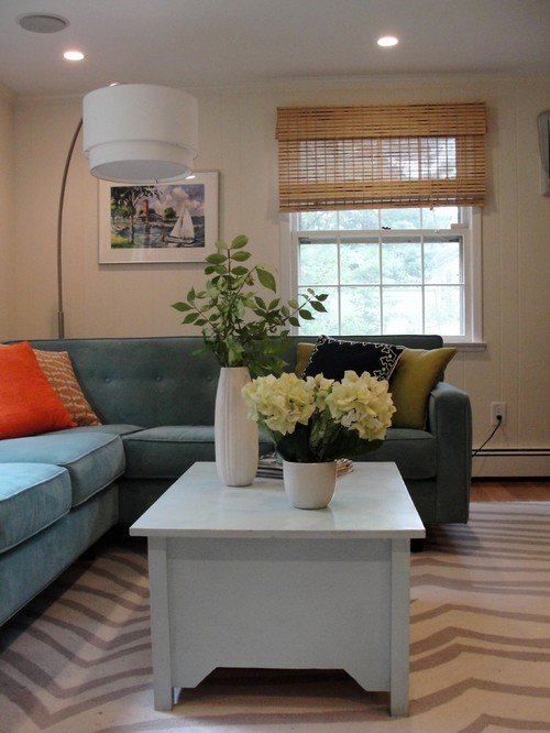
2. Rugs - a bare floor is cold to the feet and the eye, so now is a good time to purchase a rug. When in doubt about the size, go larger rather then smaller. A large rug in a small room will do wonders to that room - contrary to what you might think, it can make a small room look larger and definitely cozier. The best material for rugs is wool. It has the best feel, luster and durability.

3. Window treatments - at night, bare windows "suck" the light out of the room, and leave you feeling exposed and cold. A few tips - get two panels for each window, and hang them either from ceiling to floor or a few inches over the window trim down to the floor. Lined curtains can also add some insulation. If you are not a fan of curtains, try roman shades or wove shades and mount them inside the window frame to keep the architecture of the windows exposed.

Amy Lau Design


5. Fireplace - I know. It's obvious, right? lighting up your fireplace in the winter is an instant fix, but what if you don't have a fireplace, but want to create the look and feel of it?
Here's a great idea I found on houzz.

4. Accessories - floor and toss pillows, blankets, scented (or non scented) candles are obvious choices for warming a room. Accessorizing is also a way to introduce more color and personal style. If your color palette is predominantly neutral, you can accessorize with warm colors for the winter and cooler for the summer.


That's it! Simple. If you decide to try these suggestions (the first three are the most important) I would love to see the results.

Stay warm
Vered