
Mostly it's because they're not sure where to hang them, which height is best and how to group them together effectively.
But it's not just that. Hanging pictures is often associated with much anxiety, especially the fear of "making a mistake" and, god forbid, poking unnecessary holes in the wall. Even though it's easy enough to fix a tiny hole, which you can otherwise simply "cover up" temporarily (or not) by the picture you're hanging, people get so worried about making extra holes in their walls that they put off hanging their beautiful art for too long.
My husband thinks I have the opposite problem.
Whenever I decide to hang a picture, nothing will stop me. I know I might mess up the first time, which I usually do, but that's ok. I usually "cover up" the few extra holes with a picture until they get repaired. Seriously, it's not that big of a deal.
We've been trained from early age to fear of making mistakes, but the truth of the matter is that most of the good stuff we get in life comes with that risk.
Picture grouping ideas
If you have a large empty wall space to hang more then one picture on, grouping a few together can be a very effective way to fill up that space.
Here are some ideas. We'll start with the simple ones:
Grid - using the same frame and matting for your photos or pictures will make it easier to balance. If you hang them close to each other, use large matting to give each picture some "breathing room"


If you'd like to get more creative, you can use colored matting with black and white photos. Keep the frames identical or closely similar.

Single row - works well when you have a short but wide space for art display such as over your bed, a long dresser or a sideboard. To create the look below, keep the frames identical. However, an interesting display can be created with different frames and sizes as long as you keep it balanced:
1. Center the art on a horizontal line
2. Use symmetry (see picture below) to help keep it balanced

 |
| Symmetry helps balance art groupings |
It's easier to work with framed photos because they have similar "visual weight" which helps with achieving a balance display.


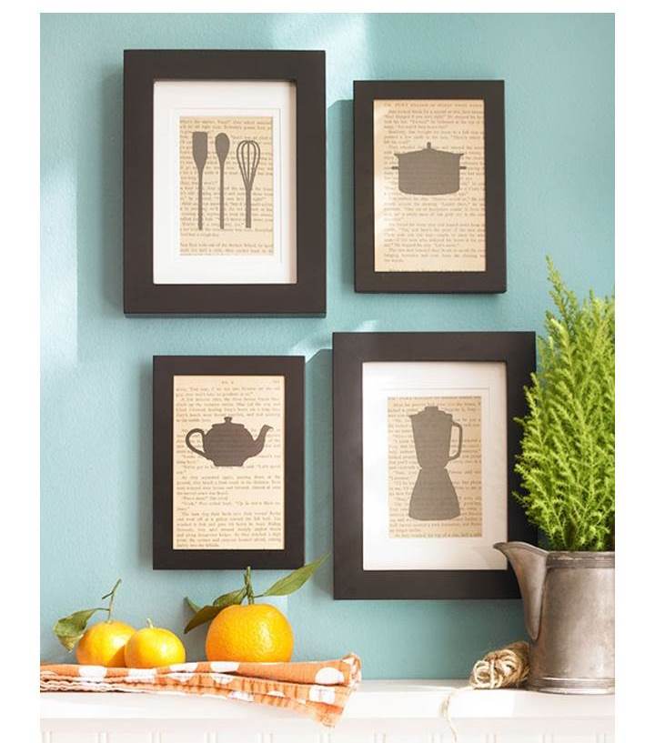
Group it inside a rectangle
Another way to group art is by filling up a space, such a as a rectangle. You can mark the space first with a masking tape and adjust it as you go. It help if you place the pictures on the floor first.
Using brown paper mock ups is another way to play around with your art before you hang it up on the wall.

 |
| Group it inside a rectangle |
Here are a few ideas of rectangular groupings.
You can use different frames, but group similar ones together. A symmetrical display is easier to pull off then an asymmetrical one.
 |
| Symmetrical display |
All black and white framed photos (with similar frames)

Asymmetrical display
 |
| Asymmetrical display |

 |
| Asymmetrical display |
 |
| don't be afraid to "go outside the box" |
A great way to display family photos or art is by grouping them over the staircase. It helps to mark where the bottom of the frames will go. This line will be parallel to the staircase. Make sure not to hang pictures too low so they won't get knocked off when going up and down the stairs.

 |
| Vered Rosen Design |
instead of "filling a space" you can hang pictures over or under a horizontal line (or center) when the space is wide and short. You can also use a vertical line when the wall space is narrow and tall.

Group it inside a circle
This kind of display is more casual then the rectangular one, and can work if you have different sized pictures, a combination of very small ones and medium sized ones. It can be a very pretty display on a small wall over a sideboard or any low and narrow furniture piece.
To pull it off, you can use brown paper folded four times and cut it to create a circle or oval mockup.

If you have any photos of art grouping display that you love, please share!
If you need some help with deciding how to group your art, you can contact me at

If you have any photos of art grouping display that you love, please share!
If you need some help with deciding how to group your art, you can contact me at
 |
| home |


