
Every year, Pantone selects a single color that is supposed to reflect and influence the current trends in fashion and home decor. Is that so? it depends on the year.
Some years the chosen color became very popular and showed up everywhere in fashion and decor (like Tangerine in 2012). Other years, like last year's Radiant Orchid, it was almost ignored.
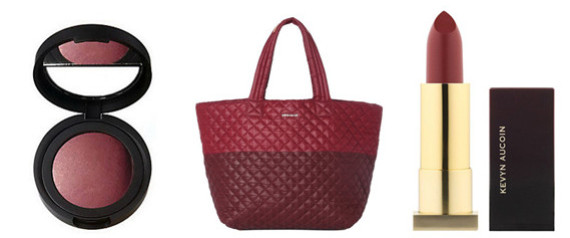
This year Pantone chose Marsala

Here's how Pantone explained their choice:
"Marsala enriches our mind, body and soul, exuding confidence and stability. Marsala is a subtly seductive shade, one that draws us in
to its embracing warmth.
Here's my take on this color choice.
I can definitely see this color making it's way into fashion. It's a flattering color for both men and women.
And for those of us who don't feel comfortable wearing bright colors, the last few years have been difficult to shop for clothing (colored). Other then the basic black, gray, white, most accent colors have been too bold for some of us to wear.
So if you're like me, you stuck to the basics: Black, gray, white etc.
Having a choice of a muted color like Marsala is refreshing. It may even bring in a whole new trend of softer, less bold colors in fashion.

As for decor, it will be hard to mix this muted, earthy color with bright, fresh colors that we've seen all over in the decor world. So my prediction is that it might be too early for this color to be incorporated into the current trends (bright and fresh).
Will this muted color is a sign that we will moving slightly away from very bright to somewhat more subdued, muted hues? maybe.
what do you think?

houzz

No comments:
Post a Comment