Tuesday, October 29, 2013

A COOL IDEA THAT MAY SOLVE YOUR HARDWOOD FLOORING DILEMA

Have you ever seen a pretty transition between two distinctly different hardwood floors?
I rarely do. It's either "old vs. new" oak flooring, which rarely match in their tones, or two different hardwood floors on either side of a sharp transition line.
That's why I was so delighted when I saw what my dear friend Shiri came up with to smooth out the transition between her oak and cherry flooring. 

Here’s what it looked like:


Doesn't it look so much better then if there was a sharp transition line between the oak and cherry flooring?  It's also cool how a solution to a "problem" ended up as an artistic statement by itself.
Here's another idea - when choosing new flooring to be installed next to old wood flooring, make sure the two wood floors match by color and tone. Grain difference is much less important. Below is how my old oak flooring looks like next to the caramelized bamboo flooring we installed in the kitchen (over the ancient and ugly mint vinyl flooring). 


See how the tones match? the fact that the grain is different doesn't bother me. It sure would have bothered me if the wood tones were very different.
Will you share your ideas of how to create a smooth transition between two different hardwood floors?
If you've been struggling with making the right choices for your own home design projects, you might benefit from some guidance. 
call or email me at 617-584-9965 vered@veredrosendesign.com

houzz


Sunday, October 6, 2013

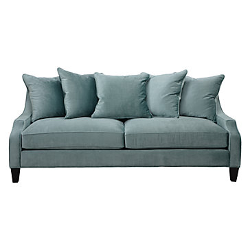
WHY AQUA IS SUCH AN AWESOME COLOR FOR A SOFA

Yes, I know. The "safest" upholstery colors for a sofa are neutrals like gray, beige or white. Sometimes  it's not the best choice. For example, if everything else in the room is fairly neutral (sisal rug, gray/white walls, etc.), choosing a colorful sofa may be just "it" if you want to bring some color into the room.
So which color is best? it depends on your preferred color palette (greens/blues or reds/golds/oranges), but some colors are better simply because they blend well with many different colors. One such example is aquamarine. It works well with so many other colors:
orange, yellow, apple green, blues, white, cream, beige, gray etc.


I've noticed this because two of my recent clients have purchased aquamarine sofa's and they look fantastic. For a bolder look, you can pick out a deeper hue, like teal, and for a softer look, pick out a lighter, grayer hue.


Portfolio eclectic living room
Bold teal sofa complements greens and blues (Katie Rosenfeld)

Aqua Sofa Design Ideas, Pictures, Remodel, and Decor - page 7
softer hues of aqua complement neutrals (Tobi Fairly)

Aqua blue sofa completes this room...

Aquamarine color combinations

Aquamarine work well with: orange, apple green, yellow, pink, cream, gray, beige, white and other blues. Below you can see the same sofa with different pillows: greens/blues/white vs. orange/white
                               Queen and Prince Philip at Ascot... blue aqua combination hat that accompanies the outfit.

                                               
contemporary family room, Newton MA - contemporary - family room - boston - Vered Rosen Design
aqua can work with greens and blues

  Love, love, LOVE the orange and aqua combination
orange and aqua or turquoise go well together
contemporary family room, Newton MA - contemporary - family room - boston - Vered Rosen Design
aquamarine and orange/cream pillows


Millie Sofa in Aqua Blue

Living Room | aqua sofa, pops of yellow & orange


Mixing with neutrals:

                                                  Cape Cod Fun
Even pick can be accented with aquamarine

                                      The fresh pink and aqua combination in this living room is really quite lovely (from House Beautiful)

So? what's your take on this? please share below.

vered@veredrosendesign.com  , Newton, MA
617-584-9965
blog
houzz

additional reading
A perfect spot for familly photos

home


Thursday, August 15, 2013

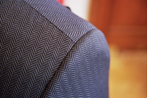
WHY HERRINGBONE IS SUCH A COOL AND TRENDY PATTERN FOR YOUR HOME

You've probably seen these two classic patterns before: on a men's twill jacket, a brick pathway or a fabric.  Herringbone is a classic pattern that looks like a broken zigzag and it's name comes from the shape of the Herring fish's skeleton.


source
Chevron is simply a zigzag pattern and it's extremely trendy right now in home decor. Everywhere you look, it's there - on rugs, pillows, curtains etc. Depending on the scale of the pattern and the contrasting colors, it can be a very subtle or bold. A small scaled pattern in neutral colors such as in the rug below will create a subtle effect vs. the bold effect of large scale, contrasting color chevron pillow or curtain.


Jute Chenille Herringbone Rug


These trendy pillows are everywhere, and like with spices, a little goes a long way. The large scale pattern with contrasting color/white combination is extremely bold, so better use them in moderation (pillows, throws), curtains. Also, keep in mind that you might get tired of them after a while, so an expensive chair reupholstering project might not be the right choice. 


A single pillow in large scaled chevron pattern and bright colors can enough "pizzaz" to wake up an otherwise static room.
When decorating with a mostly neutral palette, adding texture through pattern is a great way to make it interesting and intriguing to the eye. Both herringbone and chevron can be used at home not only as fabric patterns but also for larger areas such as flooring or a back-splash.
Here are some ideas :
Wood flooring


Tile
Style At Home Erins Kitchen 8234_2.jpg


wall paper


Any other patterns you love? please share


Thursday, May 16, 2013

HOW TO DISPLAY ART - PICTURE GROUPING IDEAS

So many people seem to have an issue with hanging pictures. 
Mostly it's because they're not sure where to hang them, which height is best and how to group them together effectively. 
But it's not just that. Hanging pictures is often associated with much anxiety, especially the fear of "making a mistake" and, god forbid, poking unnecessary holes in the wall. Even though it's easy enough to fix a tiny hole, which you can otherwise simply "cover up" temporarily (or not) by the picture you're hanging, people get so worried about making extra holes in their walls that they put off hanging their beautiful art for too long.

My husband thinks I have the opposite problem. 
Whenever I decide to hang a picture, nothing will stop me. I know I might mess up the first time, which I usually do, but that's ok. I usually "cover up" the few extra holes with a picture until they get repaired. Seriously, it's not that big of a deal. 
We've been trained from early age to fear of making mistakes,  but the truth of the matter is that most of the good stuff we get in life comes with that risk.

Picture grouping ideas
If you have a large empty wall space to hang more then one picture on, grouping a few together can be a very effective way to fill up that space.
Here are some ideas. We'll start with the simple ones:
Grid - using the same frame and matting for your photos or pictures will make it easier to balance. If you hang them close to each other, use large matting to give each picture some "breathing room"


If you'd like to get more creative, you can use colored matting with black and white photos. Keep the frames identical or closely similar.


Single row - works well when you have a short but wide space for art display such as over your bed, a long dresser or a sideboard. To create the look below, keep the frames identical. However, an interesting display can be created with different frames and sizes as long as you keep it balanced:
1. Center the art on a horizontal line
2. Use symmetry (see picture below) to help keep it balanced

Symmetry helps balance art groupings
Black and white photos
It's easier to work with framed photos because they have similar "visual weight" which helps with achieving a balance display.


Group it inside a rectangle
Another way to group art is by filling up a space, such a as a rectangle. You can mark the space first with a masking tape and adjust it as you go. It help if you place the pictures on the floor first.
Using brown paper mock ups is another way to play around with your art before you hang it up on the wall.
Group it inside a rectangle
Here are a few ideas of rectangular groupings.
You can use different frames, but group similar ones together. A symmetrical display is easier to pull off then an asymmetrical one. 

Symmetrical display
All black and white framed photos (with similar frames) 
                               

Asymmetrical display
                               
Asymmetrical display
don't be afraid to "go outside the box"
Over the staircase
A great way to display family photos or art is by grouping them over the staircase. It helps to mark where the bottom of the frames will go. This line will be parallel to the staircase. Make sure not to hang pictures too low so they won't get knocked off when going up and down the stairs.


Vered Rosen Design
Display around a vertical (or horizontal line)
instead of "filling a space" you can hang pictures over or under a horizontal line (or center) when the space is wide and short. You can also use a vertical line when the wall space is narrow and tall.

Group it inside a circle
This kind of display is more casual then the rectangular one, and can work if you have different sized pictures, a combination of very small ones and medium sized ones. It can be a very pretty display on a small wall over a sideboard or any low and narrow furniture piece.
To pull it off, you can use brown paper folded four times and cut it to create a circle or oval mockup.

If you have any photos of art grouping display that you love, please share!
If you need some help with deciding how to group your art, you can contact me at

vered@veredrosendesign.com   617-584-9965
blog
houzz

additional reading
A perfect spot for familly photos

home


Monday, May 6, 2013

BEFORE AND AFTER DINING ROOM REPAINT - A HAPPY CLIENT IS A HAPPY DESIGNER

I recently had a color consultation with a client that got "stuck" in the process of trying to choose the "right" paint color for her dining room, as well as other small projects.
As I walked through her door, I noticed two things: She was a lovely lady who was clearly into color. REAL color. Her love for jewel tones was clear both in her decor choices and the way she likes to dress. and but with regard to her dining room, she was ready for something bold.


Jewel tones
                                   
The dining room was one of the rooms she had trouble finding the right color for. The current mustard yellow did not appeal to her. I could clearly see her favorite colors simply from looking at the paint swatches on the walls, as well as the carpet, artwork and chairs. Jewel tones were clearly her favorite.
I explained to her that it's impossible to get a true sense of how a particular paint color would look if you only painted a small area and it's over an existing color, since we always see color in comparison to other colors. That's why we used my large 11x14 color boards against a white background to start the process of finding the right color. 
Moving the large samples around in the room (close to the rug, the chairs) helped see which color would match best.
We ended up choosing a cranberry/wine hue that worked out really well. It complemented the red, purple and other jewel tones in the room and made the artwork stand out. My client says it feels warm but not suffocating, which is exactly waht she wanted.
Even though we started out with a Benjamine moore color, we realized the home depot sample did not match the original Ben Moore color. However, it turned out that the "mistake" looked better then the original true color, so we simply scaled it up to a gallon of paint.
It ended up being a "happy mistake"


before

after

after

 Here's what my client reaction was:
"The color is fabulous. I think it came out just GREAT. We just put the rug back down and some of the art. I'm leaving the blinds 1/2 open so there's much more light in the room and the rug stands out nicely. The Home Depot color ended up
to be a "happy accident"


vered@veredrosendesign.com

blog
houzz